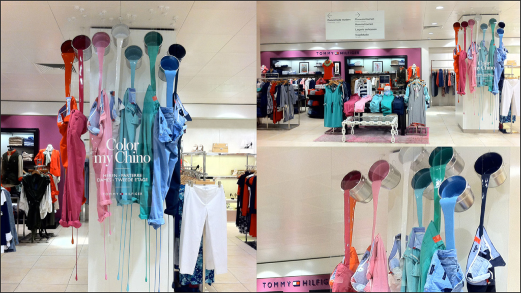
THE GOOD
I believe that this visual representation was not only creative, but it was colorful and eye-catching as well. The creator of this display used color as a merchandising strategy which includes various shades and tints of primary colors. Because these colors are somewhat a form of pastel colors, I believe this display was something displayed during the Easter season, which is a good marketing strategy as well because it goes with the holiday and the transition between selling period. Being that boys and men usually wear colorful chino pants during this season, Tommy Hilfiger is marketing to those people who get dressed in various pastel colors for pictures with the family to embark on holiday of fun. Overall, I believe that this visual display was a good one because they used color as a true marketing strategy.
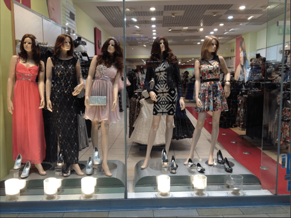
THE BAD
In this case, the visual display that this store has created would be a bad one. It seems as though they didn’t have any creative direction nor did they try to use color as a merchandising strategy. This display includes both bright and dark colors, prints, and solids as well. I honestly believe that the play on lengths and the mixture of mannequins takes away from the creative aspect of the actual pieces they’re trying sell.
