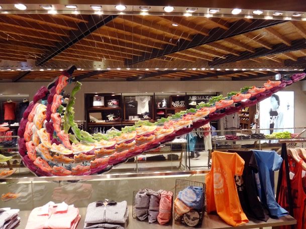
THE GOOD
First, I would like to commend whoever thought of this idea because not only is it colorful and full of life, it’s creative and really grabs the attention of the consumer when they’re either first entering the store or while browsing. I think that this idea is a great symbolization of using what you have to appropriately convey a message to the intended audience. I think that this visual display includes the two merchandising tactics rhythm and emphasis. Rhythm is being able to guide visual movement without explicitly saying or expressing so. Emphasis is heightening the visual appearance of a certain part of the store. The team at Nike performed was able to include both of these merchandising techniques perfectly.
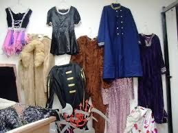
THE BAD
I think that this display is bad because it doesn’t have any synergy when it comes to color scheme or theme. There isn’t any visual movement between the pieces displayed nor is there emphasis on any of the other aspects of this display. Although I do believe that this visual display is bad, it isn’t all terrible because the products are displayed high enough for the customers to see them from across the store. Besides that, this display was a let down to say the least.
