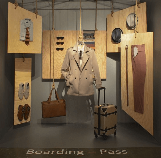
THE GOOD
I believe that this is a perfect way to be minimal, but effective at the same time. Not only does this store have a focal point, but it also has a color palette and options to mix-and-match with the trench coat to create the perfect travel outfit. This display highlights the focal point of this idea which is the trench coat. Two pairs of shoes to match, pants, glasses, a hat, and a shirt that can be chosen amongst the different choices. I think that this effectively delivers the message of this store. It tells the consumer that you can shop for the classic man here while still getting essential pieces that the unconventional man could use as well. It communicates a clear message, has a focal point, and shows the options that all men could be looking for so in my opinion, this is a really good and creative display.
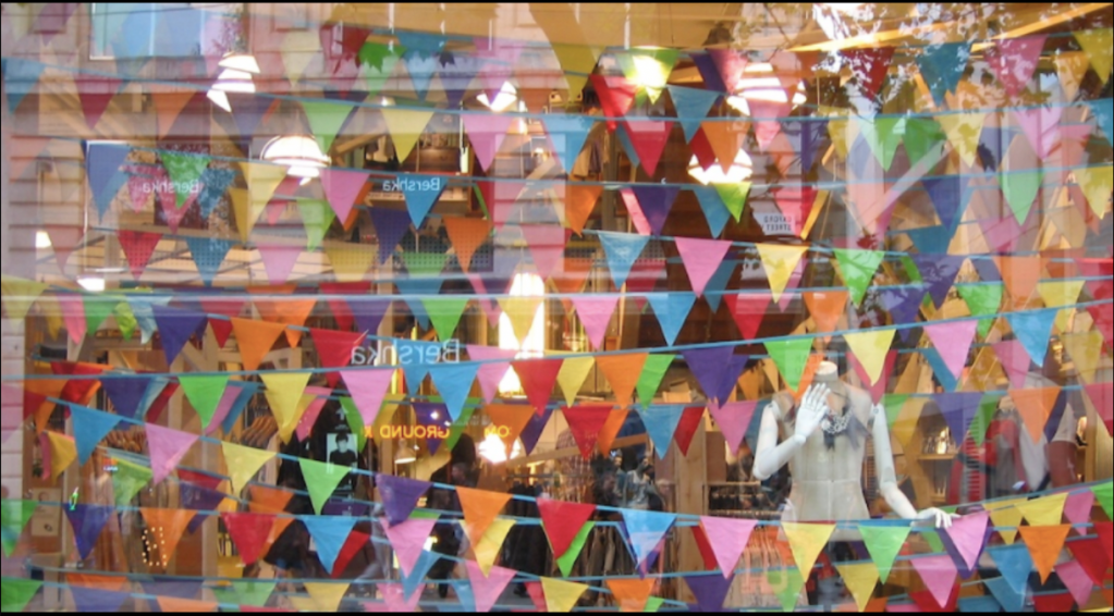
THE BAD
I believe that this display is not only messy, but it’s confusing as well. There is no real direction, focal point, or creativity in this display. It doesn’t show any real products and it looks like a crazy kids birthday party. There is one mannequin being displayed with what looks like a shirt and a necklace, but there is no invitation into the store based on this one display. I don’t feel like the curator is trying to display or send a message either. It’s almost as if they just wanted to just put a display in the window just to save the thought of the windows being filled with something.
