THE GOOD
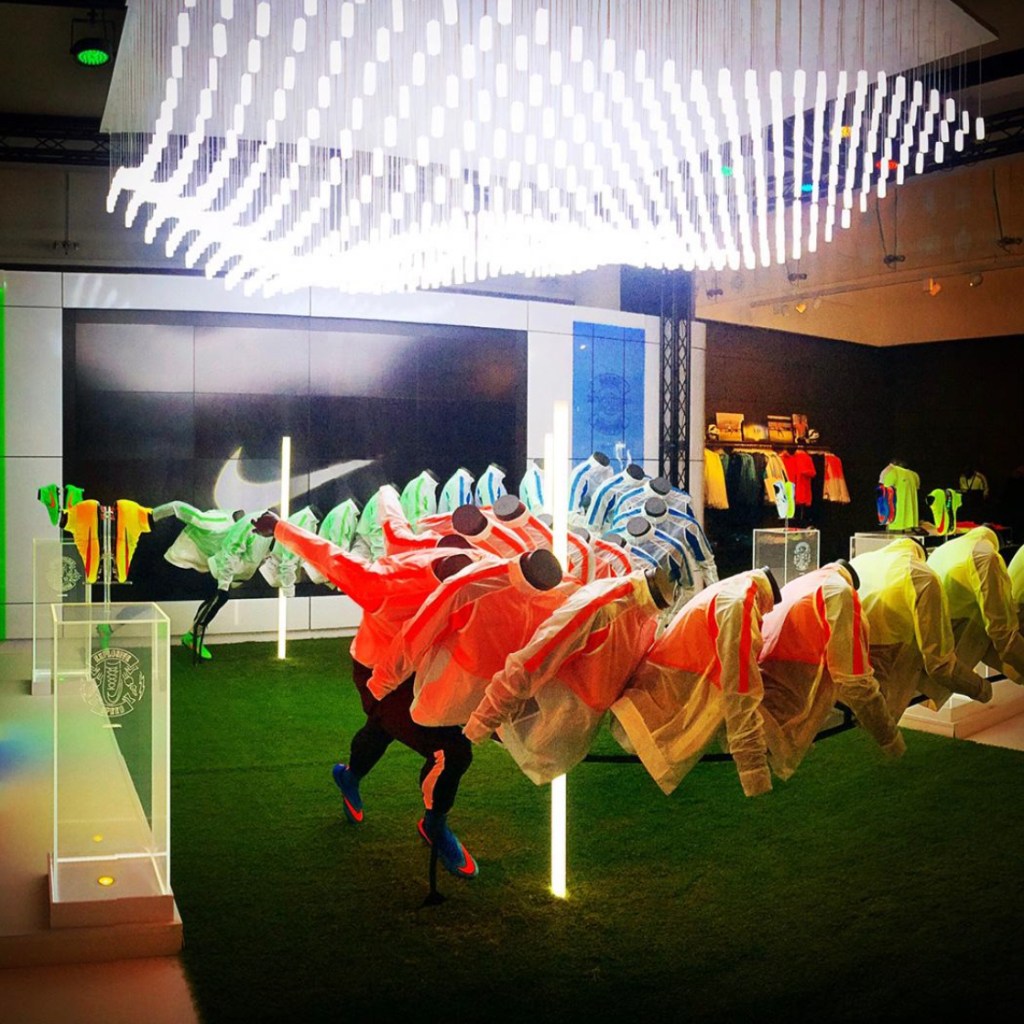
THIS DISPLAY IS AMAZING! I love how it creates movement within the area and even an ombre of colors between that insinuate’s a fast runner. The LED lights that illuminate everything under it makes the colors pop even more. In addition to that, they have active mannequins that tell a story to the viewer. It clearly explains what the projected consumer should emulate and it demonstrates how functional the clothing is for the activity they’re going to part take in. Being that Nike is a store for athletes, their clothing is pretty functional across various sports. Running is something that is pretty much included in every sport so this message can be relayed to various athletes.

THE BAD
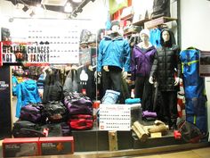
This display had the potential to be great, but the curator went too far with adding additional product in the window along with the mannequins. There is also no character to the display. From the looks of the clothing, this is an active store as well and there very well could have been active mannequins on display to actively show the functionality of the clothing. Even the colors on display aren’t terrible. Although they should have used a different hue of blue, but that’s not a dealbreaker for the potential of this window.