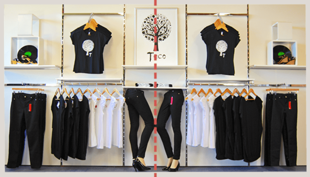
THE GOOD
The display above is the perfect depiction of a formal balance visual merchandising display. Both sides are balanced and they work together to sale one another. Though they are the same products, they look really appealing together and will most likely draw customers in to turn a store visit into a sale. Because all of these products are pretty much the same, them being just about the same length allows visual perspective to be even more pleasing. I think that this display could almost be considered repetition too. So incorporating more than one merchandising is a pretty good tactic to encourage sales.
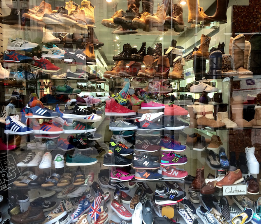
THE BAD
I think that this is a bad depiction of what a shoe display should look like. Eventhough this store may sale various styles of shoes, there is a way to display various styles without overcrowding the display space. There’s alot of shoes on display and they all seem to be on the same kind of racks, but there’s not any formal or informal balance due to the fact that you can’t really tell where one rack ends and where another begins. It seems as though the store didn’t have any direction and they just filled the window with everything they were selling at the time.
