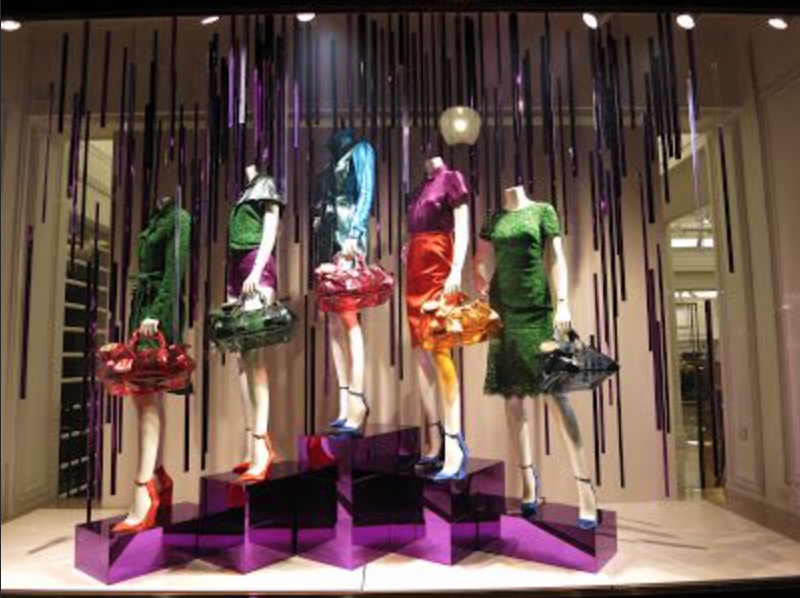
THE GOOD
I think that this display was a unique take on colors and levels, but all came together to be unified as one. Not only are these mannequins color blocked, but some of them have complimentary colored bags as well. I think that the curator of this display did so well because they really took the time to make sure the colors were in synch with one another instead of working against each other. Not only were the colors working together, but there was a sense of direction amongst the mannequins as well. Being able to incorporate color along with direction, I think is fairly easy, but being able to color block, play with levels, and have a clear direction is hard and the curator of this design killed it.

THE BAD
I believe that this is a bad visual display because there is too much merchandise in one space. This somewhat reminds me of the days when I woke at Forever 21 and teens would come in, destroy the store, and leave. I believe that this is a bad depiction of having lots of stuff in one area and it doesn’t work together. While the picture highlighted to be good in this post has alot going on, but everything is working together to make the window visually appealing.
