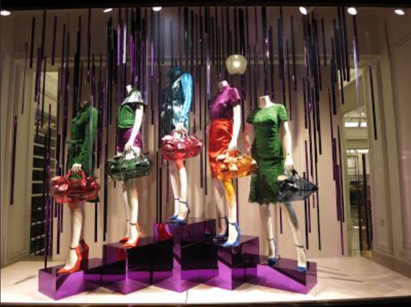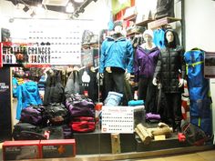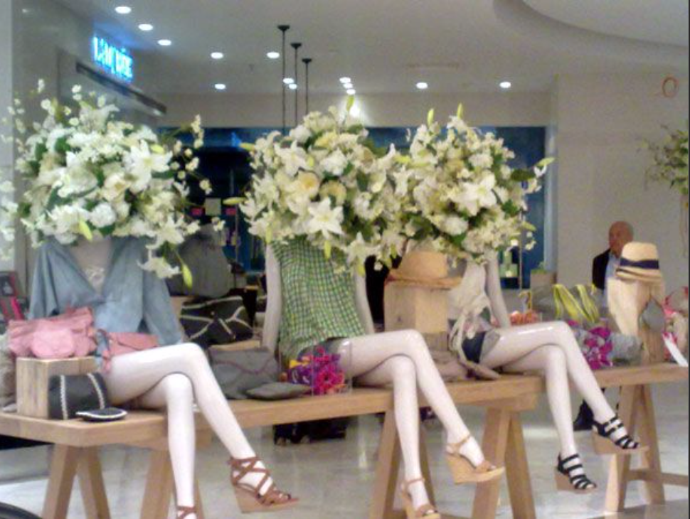
THE GOOD
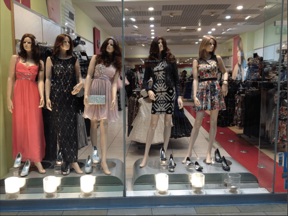
I believe that the picture above displayed unity amongst the mannequins. Not because of the way that they’re dressed (even though they’re all in summer clothes), but because of the way that they’re sitting and because they all have the flowers on their heads. Being able to unify mannequins to blend in with one another, sale the current trends, and correctly relay the message that the store is trying to portray is hard, but the curator of this design did it very well.
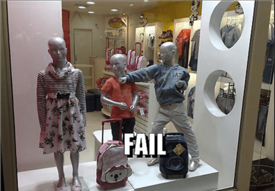
THE BAD
I think that this was a terrible display because the children are not on one accord. Their outfits or the stance. The two mannequins on the right seem to be doing some kind of movement (karate, I assume), while the one on the left is standing straight up. To make this more unified, they could have had all active mannequins who were in some sort of stance other than standing straight up. Or, they could have had them all standing straight up with the girl in the middle to create some balance.