THE GOOD
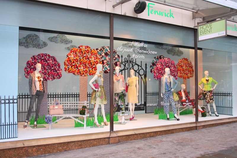
The picture above represents good visual merchandising. Not only is there a theme of the window display, but there is also a good color story to match, along with various design elements and principles used. I assume there is a “Spring” theme,hence the kind of clothing the models are wearing, the prints, and the colors as well. There are colorful tree’s, sleeveless and short sleeve dresses in sight, and the setting is most likely the park on an afternoon day. A few design elements used in this display are color, proportion, and tension. Color was a design element introduced in this display because majority of the colors displayed are spring colors like blues, reds, and yellows. Proportion was introduced in this display as well. There are 7 models displayed; 3 on each side of the window with 1 in the middle, a white bench on either side, as well as the same amount of trees on both sides. This demonstrates proportion to me because the display is equal on both sides of the display. Not only are the mannequins and other props displayed as equal weight, but so are the colors. Tension was also introduced in this visual display similar to the display we learned from in the powerpoint presentation. The trunk in the presentation and the salmon colored purse in the window display display the same characteristics of suspense.
A couple of principles of design or “rules” that were introduced in this window display are unity and harmony, along with balance. We learned that harmony and unity are one in the same. All of the elements in the window display stand well together; from the theme, to the colors, to the clothing and the assisting props too. Balance, which can be somewhat described as equal to proportion, is presented in the visual presentation as well.
THE BAD
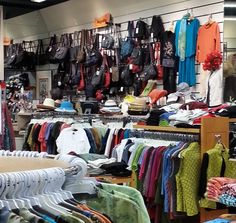
The picture above is an example of bad visual merchandising. All of the design principles and elements discussed above are not presented in this picture. There’s no balance, color story, proportion, or unity anywhere in the picture. I can spot hues from all over the color wheel, but everything on the display wall is crowded and off balance. There is alot of different products being displayed at one time, there’s no unity between the different products, nor is there a story being told. I think that if the bags hanging on the wall were separated and equally placed, there would be some elements and/or principles introduced.
